1
2
3
This was a pitch created for a proposed redesign of Disney Kids’ tv channel.
My role: Art Director & Designer
These mood boards propose 3 different potential directions for the network redesign, establishing a direction for color palette, typography, and composition. Nickelodeon and Disney were in tight competition, and Disney wanted to redesign with a more sophisticated look to match the aspirational work that Nickelodeon was doing in appealing to tweens (kids 9-12).
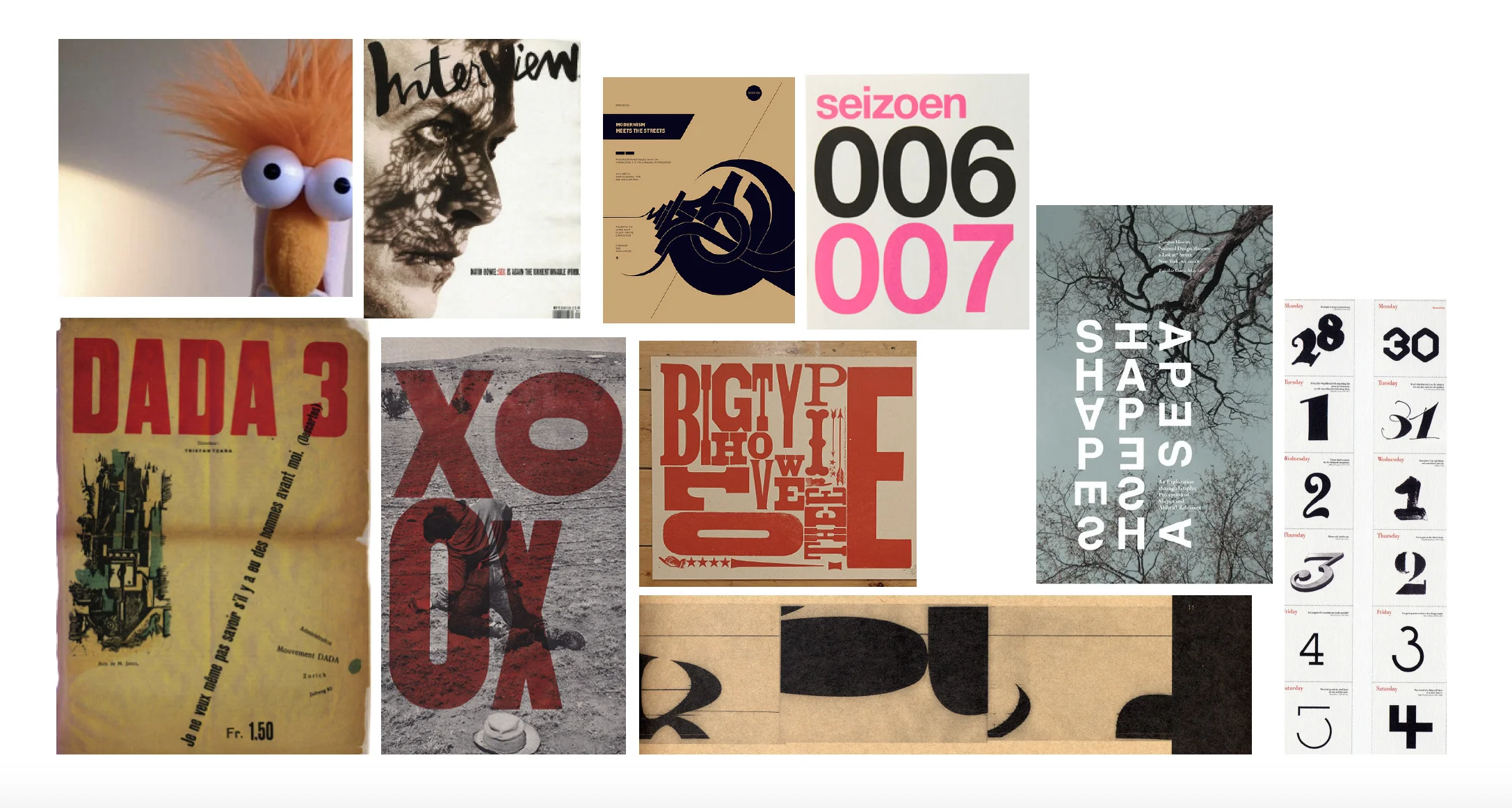
DIRECTION 1: Straight to the point. Characters that kids love are the highlight. BIG crops of characters’ faces and very BIG, clear type. Only the information you need onscreen and nothing else. The image cropping creates a fresh, communicative feel and also inspires a choppy, fun animated style. Idiosyncratic, eclectic mix of typefaces.
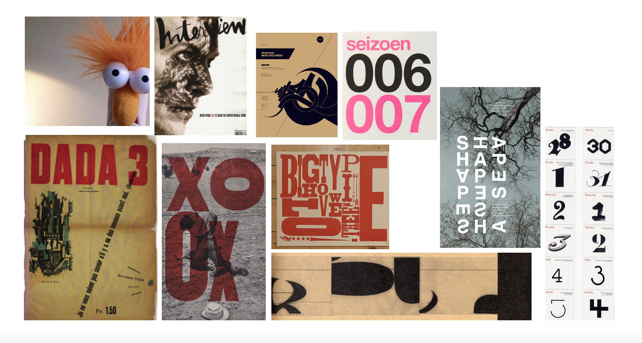
DIRECTION 2: Using a system of circles and stripes to make patterns (from very simple to complex) and holding shapes. Bright, well composed colors create a confident, active, energetic mood. Overlapping shapes and colors create new colors and depth.
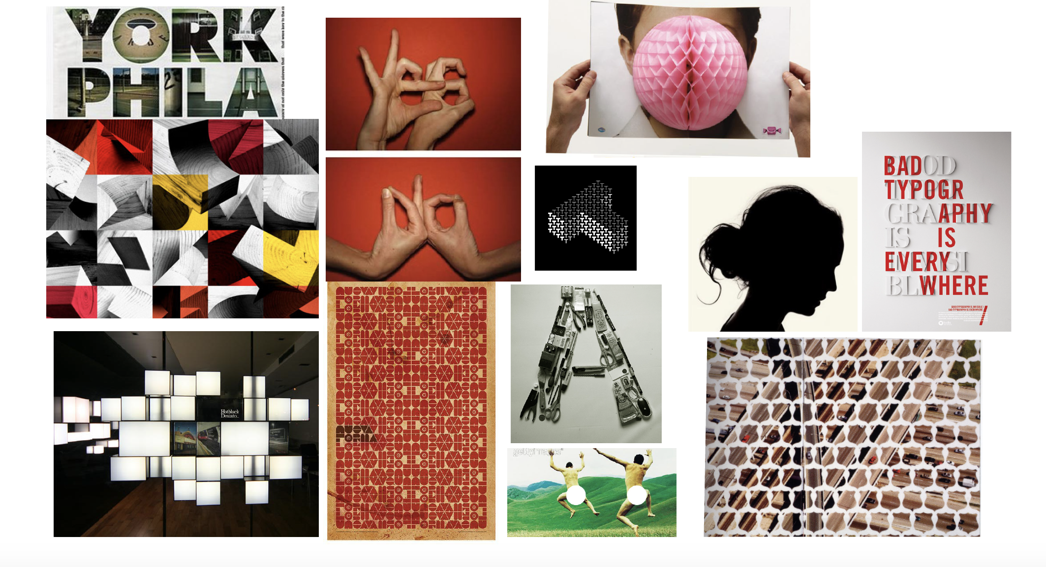
DIRECTION 3: There’s something exciting about a revelation. Different visual methods could be used to hide and then reveal an element which supports the main tune-in message. Kids’ hands move elements around in the frame (showing that kids are in control).