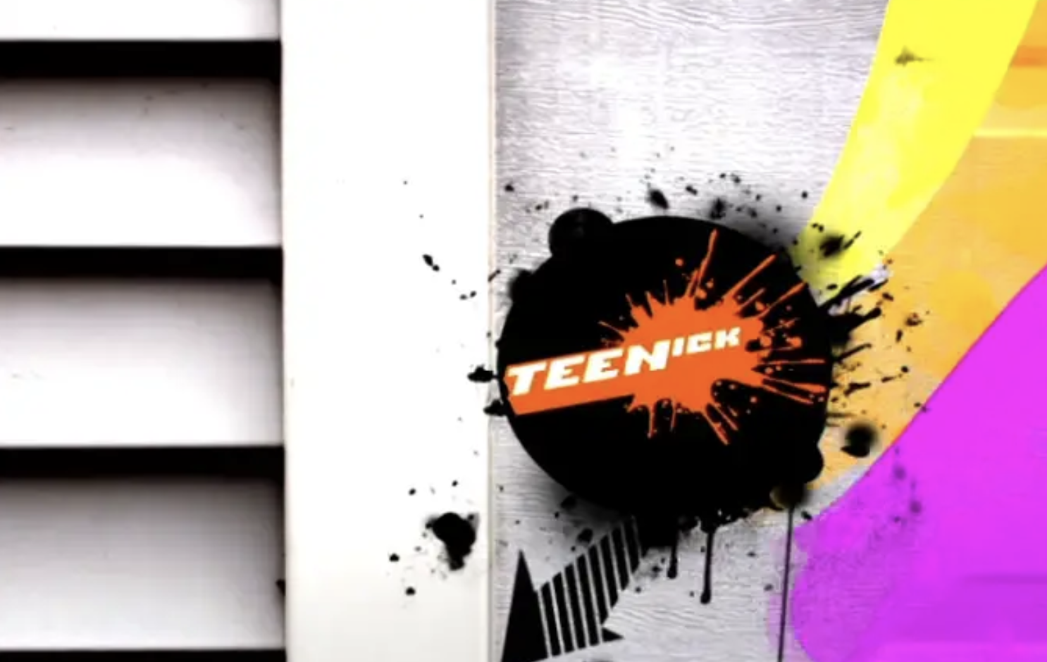
TEENICK:
NETWORK REDESIGN
Context:
TEENick is a creative sub-brand of Nickelodeon designed to appeal to aspiring teens (girls and boys ages 9-12). This programming segment needed a new on-air brand toolkit, including a logo redesign and a complete new look. The previous design was outdated and hard to use on-air. Some of the goals of the redesign were to showcase TEENick graphics and talent in the context of real kids’environments, to make the look relatable to tweens/teens, and to showcase TEENick talent as celebrities and make them shine.
My role:
+ I led the design rebranding of TEENick. As art director I wrote a creative brief for the project, and invited 3 design companies to pitch their concepts.
+ I selected the winning pitch, and oversaw the entire execution of the design from beginning to its final implementation on-air, collaborating with Adolescent, a NYC design company.
+ The final toolkit integrated existing show logos into a seamless, flexible design used on-air and online. The contemporary, iconic graphics system is comprised of graphic patterns, buttons, and stickers as a showcase for changing TEENick talent and logos.
The rebrand resulted in increased viewership of the target market—viewership grew from 1.65 million to 2.14 million during this time.
See the TEENick brand style guide.
Design/Animation: Adolescent
Photography: Yoko Inoue


